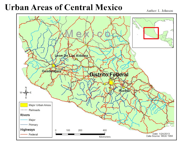
Wednesday, January 30, 2013

Cartographic Skills, Lab 3: Data Classification

Figure 1

Above, Figure 1, shows four variations of the percentages of African Americans in Escambia County.  I used four different data classifications including Natural Breaks, Equal Interval, Quantile and Standard Deviation.  As you can see, the way the data is classified changes the map.  You get several different interpretations of the concentration of African Americans.  This tells us that the classification method we use is very important to conveying the intended information.


Figure 2

Figure 2, is a single map using the Natural Breaks classification.  It is a larger version of the Natural Breaks image in Figure 1.  I believe that this classification works best for this data because it allows us to better visualize the differences in the towns.  This classification method groups similar values together to minimize the differences.  The legend doesn’t have any confusing gaps and, when looking at the map, the reader should easily recognize where the highest concentration of African Americans are located within the county.  When looking at the physical data itself, this is the type of map I would envision.

Thursday, January 24, 2013

Intro to GIS, Lab 3: GIS & Cartopgraphy


This first map is a basic map of the country of Mexico.  From it, you can see the populations of each individual state.  They are all labeled clearly and the legend helps you establish meaning to the different colors.  Some key points that I took away from this map were how to label individual states and how to pick a useful color ramp.


This second map zooms in to central Mexico and focuses on some different features.  Here you can see the major urban cities of central Mexico along with the railroad system, rivers and main federal highways.  Each feature is labeled with a color based on the cartographic appropriate symbology color guide.  The inset map allows you to see what part of Mexico we are zoomed into and provides a good worldly reference.  For some reason, I had a rather difficult time trying to isolate the major urban city labels.  However, with trial and error and the help of fellow classmates, I was able to figure it out.


This last map is a topographical map of Mexico.  Based on the color ramp that I've selected, you can see the different elevations throughout the country.  As you can see in the legend, the darker the color, the lower the elevation and vise versa.   I provided an inset map to give you a reference as to where in the world we're looking, in case one is unfamiliar with Mexico's locale.  While working on this map, I learned the differences between a stretched symbology scheme and a classified symbology scheme.  


Sunday, January 20, 2013

Cartographic Skills, Lab 2: Statistical Foundation


This is a scatterplot that I created for this lab.  It shows the population growth for two states, Alabama and Alaska.  As you can see from the legend provided, Alabama is represented in blue and Alaska in red.  This graph is useful because it also provides you with an estimated population for the future until 2025.  I created this by using Excel and the scatterplot function.  I placed a linear trendline on the graph for each state, making it easier to see the trend.  A linear trendline (rather than polynomial) worked better for this graph because there are no drastic changes, rather a steady and slight growth.  The equations for each trendline are provided, along with the coefficient of determination.

Intro to GIS, Lab 2: Own Your Map


This is a basic map that I have created of Escambia County.  From this map, you can see where in Florida, Escambia county is located.  I then created a "close-up" view of the county itself.  Based on the clearly labeled Legend, you can see major interstates, rivers and the location of the UWF campus.  I've included the eight essential map elements including a title, scale bar, legend, north arrow, border, date, data source and my, the cartographer's, name.


Monday, January 14, 2013

Cartographic Skills, Lab 1: Map Critique

Poor Map Design:


I think this is a relatively poor design for a map. There is too much unnecessary information (map crap) that just clutters up the map as a whole. They could have left out the names of the unrelated towns (where there are no hiking trails). The symbols they used to label the trails are not specific enough as they could be (i.e. attach or point to actual trail). Why are some blue and some white? What is the difference? Perhaps if they used different colors for each trail, it would be easier for the user to understand the parameters of the trail. There is no legend, title or explanation. There doesn’t seem to be any emotion or passion implemented into this map. The layout is relatively useful for the shape of the state. The one downfall of the layout is the lack of (space for) information (i.e. legend, explanation etc.).

Good Map Design:


This is a well-designed map (with the one exception of a clear title). This is a map of the MBTA (subway) system in Boston. Each train line is clearly labeled in different colors. Each stop is marked with a symbol, which, is indicated, in the provided legend. The only information that is labeled on the map is the important information. They included some major roads, to help with location relativity, but used a faded gray allowing it to almost fade into the background. The map layout optimized the space and the legend is placed in a useful space with clear, key elements. It is easy to read and understand.


     Source Information:           
          1) CT Hiking Trails:  I found this map through "Connecticut Forest & Park Association." It is located here.
          2) MBTA Subway System: This is from the Tufts University website - connecting students with a map of Boston's subway system.

Sunday, January 13, 2013

Intro to GIS, Lab 1: ArcGIS Overview


Here is the result of Lab 1.  This is a very basic map showing the world population by country.  Cities are designated by the smaller black dots (as seen in the Legend).  The only real problem that I encountered while working on this lab was saving it to the correct drives and being able to access it on my personal computer.  Perhaps this is something I need to focus on.