Tuesday, December 10, 2013

Remote Sensing & Photo Interpretation Final

For my final project for this class, I decided to do a Land Use Land Cover analysis of the Lake Tahoe Basin region.  As you can see, it remains mostly mixed forest, however urbanization is the on rise. 

Lake Tahoe region Land Use Land Cover analysis.

Sunday, December 8, 2013

Internship Final Project

Link to Model Builder Power Point presentation.

Special Topics, Forestry, Project 5

Lynne Johnson
December 8, 2013
Special Topics – GIS 4930


Maple Sap Production in the Acadian National Forest Abstract


Clear-cutting is a traditional practice in the timber industry that generally has negative connotations.  This study focuses on an area in the Acadian National Forest and attempts to evaluate the clear-cut areas for maple sap production.  A variety of Geographic Information Systems (GIS) techniques and analyses were performed.  If enough trees prove to be sufficient in sap production, currently and in the future, then this will provide a productive alternative to clear cut areas.  A cross tabulation was created of the distances it would take to haul the sap to the nearby roads.  Results were then created and presented.

Power Point Presentation Link.

Tuesday, November 26, 2013

Special Topics, Week 13: Forestry - Report Week

This week finalized our analysis of clear cutting.  This topic was interesting and definitely had me divided about whether it's a good thing or a bad thing.  My final opinion and side was that I feel that it's not great but it's necessary.  If it's done correctly and follows the regulations that are set in place, then it can be a sustainable and profitable practice.  We had to create a poster, claiming our position and backing it up with analysis and additional scholarly articles.  


This poster was created to share my opinion of clear cutting practices via 
GIS analysis and research from scholarly articles.  I think it's an 
unfortunate necessity.  Regulations are in place for a reason
and as long as they're followed to point then it'll
be a profitable and sustainable practice.

Monday, November 18, 2013

Special Topics, Week 12: Forestry - Analyze Week


Clear-Cutting: A Necessary Scar

Ecological Summary:
Clear-cutting is and has been a very controversial topic.  The ecological effects it has on the forests vary greatly on the individual site.  Studies have shown that most of the detrimental damage that is done is not due to the actual cutting of the trees, but more of the processes that coincide with the practice.  The quality and quantity of the roads that are used to get the trucks and equipment in and out of the area will have a tremendous impact on the area ecology.  The area preparation techniques and amount of damage control that is done to prevent injury to non-targeted plants and trees will also limit the ecological determent.  If clear cutting is approached in an area specific manner with ecological conservation in mind, it can be done right. 

Sources:

Ecological

Rodney J. Keenan, J. P. (Hamish) Kimmins. 1993. The Ecological Effects of Clearcutting. Environmental Reviews, 1(2): 121-144, 10.1139/a93-010. [November]:http://www.nrcresearchpress.com/doi/abs/10.1139/a93-010#.UoJP4pR4Yk8

Economic

Andreassen, K., Oyen, B.H., 2002. Economic consequences of three silvicultural methods in uneven-aged mature coastal spruce forests of central Norway. Forestry, 75 (4): 483-488.doi: 10.1093/forestry/75.4.483. [November]: http://forestry.oxfordjournals.org/content/75/4/483.full.pdf+html

Aesthetic

Brent C. Chamberlain, Michael J. Meitner. 2012. Quantifying the Effects of Harvest Block Design on Aesthetic Preferences. Canadian Journal of Forest Research, 42(12): 2106-2117, 10.1139/cjfr-2012-0210.  [November]:http://www.nrcresearchpress.com/doi/abs/10.1139/cjfr-2012-0210


Special Topics, Week 11: Forestry - Prepare Week

Clear cutting is a very controversial topic yet a necessity in order to produce many of the every day products we use.  There are, however, different ways to approach this practice. This week we used our analyzing techniques to establish the amount of clear cuts that are visible to the main roads in an area in New Brunswick, Canada.  We determined which areas were clear cut, determined the age of the clear cuts and also took into consideration, the elevation and terrain.  This will factor into the ability to see from the roads.  We used a variety of search queries and the viewshed tool for this.


Basemap of Fredricton, New Brunswick and study area
Map of clearcut which are visible and non-visible from the main roads


Wednesday, November 13, 2013

Remote Sensing & Photo Interpretation, Mod10: Supervised Classification

We had to create a map of Germantown, MD using supervised classification.  We established the land use type by creating specific signatures for each classification and AOI features using ERDAS.  By utilizing a satellite image, I was able to determine and differentiate between different types of land use.  The hardest part I found was making the roads and the agricultural lands separate.  There was some spectral confusion between the two because the bands were very similar.  Below is my resulting map.

Supervised Classifications of Germantown, MD land use.

Tuesday, November 5, 2013

Special Topics, Week 10: Web Applications - Report Week - Final Story Map

This week we had to add one more customization to our story map and fine tune the map as a whole.  For my customization, I decided to add a zoom level to each point feature.  Initially, you're zoomed out, able to see from Chicago all the way to Hawaii.  As you go through the slide show, you're zoomed into that city.  Most of the time you're able to see all points located in the city at once.  I felt like this zoom level was optimal because it gives viewers some choice about the zoom level.  I also decided to change my map summary and edit a few of the site descriptions.  Here is the final link to my story map featuring my move to Hawaii!

Remote Sensing & Photo Interpretation, Mod9: Unsupervised Classification

This week we used both ArcMap and ERDAS to perform an unsupervised reclassification of a provided image.  The image we used for our final map, was of the UWF campus.  The ultimate outcome of this map was to determine what percent of surfaces is permeable and what percent is impermeable.  We originally reclassified to 50 different classes and then worked with a specific area in the image to break it down to 5 categories: Trees, Grass, Buildings/Roads, Shadows and Mixed.  After the classification was complete, the final map product was produced in ArcMap.


Unsupervised Classification of the UWF campus.  Area shown in acres with the estimate that about 58% is
permeable while the remaining 42% is impermeable.

Friday, November 1, 2013

Special Topics, Week 9: Web Applications - Analyze Week - Online Story Map

This week we put our story board plan into action.  Initially, we needed to find images for each of our locations (a full size image and thumbnail for each).  We then needed to edit the CSV template to contain our information, lat and long coordinates, URL links to images and thumbnails, a title and description.

From here, we uploaded the CSV into arcgis.com into a web map.  This automatically placed pin points at each of our locations.  We chose a base map that was appropriate and added an additional layer that pertained to the theme and feel of our story board.

Finally, we needed to edit scripts in the index html and the map configuration.  We needed to make sure the code knew which map we wanted to work with and where it could be found.  The last item was to add the UWF logo to the top right of the map.

I ran into a few issues that were pretty frustrating, but the major roadblock turned out to be an extra "s" in the hyperlink.  With endless troubleshooting and help from the professor, TA and classmates I finally have a rough draft to present.  Here it is.

Tuesday, October 29, 2013

Remote Sensing & Photo Interpretation, Mod8: Thermal & Multispectral Analysis

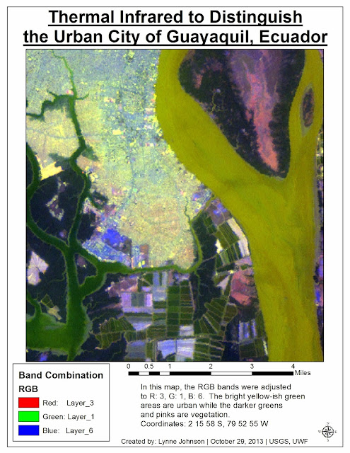
For this lab, I utilized both ERDAS and ArcMap to combine several layers of imagery into one single multispectral layer.  In order to get my specific feature, the city of Guayaquil, to stand apart from the rest of the image I needed to find the right band combination.  By working in ERDAS and ArcMap, I was able to fool around a bit with the bands and histograms until I found a combination that I liked.  This combination then needed to bring out the urban areas of the city and provide an obvious distinction between urban and vegetation, agricultural and even the river. 

I think my final combination of R: 3, G: 1, B: 6 and adjusted breakpoints really creates an image that allows you to see the urbanized areas of Guayaquil, Ecuador.  These areas appear as a bright yellow-ish green color which contrasts nicely with the dark greens, blues and pinks of the other parts of the land.  This also allows the river to be a lime color with a smooth and constant texture.  


Urban areas of Guayaquil, Ecuador using the band combination of R: 3, G: 1, B: 6.

Thursday, October 24, 2013

Special Topics, Week 8: GIS Web Applications - Prepare Week - Storyboard Development

This week we started a new module and we're focusing on GIS web applications.  We're working on story maps.  Story maps are interactive maps that are generally less technical and more descriptive.  They are designed to tell a story but they also include pictures or images, descriptive texts, attached documents and even helpful hyperlinks.  For prepare week, I put together a storyboard for what I want my story map to show and how I want my story told.  The basis of my map is going to be my move from Wisconsin to Hawaii.  I'll be flying out of Chicago, have an extended layover in San Diego to see some sites and friends and I'll land in Honolulu.  I'll see some classic Honolulu sites before my final flight to the island of Maui.  I want my map to show my trip and the sites that I am going to visit along my way.

I plan on using various images and configured pop-ups to convey information about the individual sites.  Below is an example of one of the images I might use for my stop in Honolulu.

Diamond Head Crater State Park, Honolulu, HI

Monday, October 21, 2013

Remote Sensing & Photo Interpretation, Mod7: Multispectral Analysis

This week we worked with multispectral analysis.  We used various techniques to locate and identify three different features based on their histograms of each layer.  Once the features were identified, we changed the bands in order to make that one feature more prominent.  As you can see in the first map, the feature was deep water.  I decided that bands - R: Layer_5, G: Layer_2 and B: Layer_3 worked best to emphasize the deep water.  The dark blue/black lakes really stand out against the red land.


Deep water is the prominent feature in this map - clearly standing out as the black/dark areas.

The second feature we needed to identify based on histograms and an Inquire Cursor was snow-capped mountains.  To be sure that the mountains that are snow-capped really stood out and became the prominent feature in the map, I worked with the bands to create the following image.  The snow, keeping white, really pops against the green/brown landscape.  I went with: R: Layer_3, G: Layer_2 and B: Layer_1.


The snow-capped mountains are the prominent feature in this map.  Keeping the snow white and mountains green really gives a good perspective. 


The third and final feature that was identified was shallow water.  As you can see, the show water is displayed as a light and bright blue.  It distinctly stands out against the dark, almost black deep water and the red land.

The shallow water in this map stands out as it is a much brighter blue compared the the dark, almost black deeper water and red land.

This lab seemed to be pretty unclear.  There was a lot of trial and error and communication between classmates in order to figure things out.  I felt that maybe more detail or insight needed to be included in this lab.

Wednesday, October 16, 2013

Remote Sensing & Photo Interpretation, Mod6: Spatial Enhancement

This week we mainly worked with ERDAS and learned about spatial image enhancement.  We had a few exercises (one that had to be cancelled due to the wonderful government shutdown) that taught us about the various tools in ERDAS to create image enhancement.

We were provided with an image that had significant striping and image distortion.  Working with the Convolution filter, we used different kernel settings to manipulate the image.  Another tool that was utilized as the Fourier Transformation function.  This function greatly reduced the distracting striping in the image.  Playing around with the different kernel settings and the Fourier transformation editor, a final image was created that has limited striping, yet still maintains a certain amount of image clarity and detail.  


Spatial image enhancement after various kernel setting adjustments in the Convolution filter and a run through the Wedge tool.

Tuesday, October 15, 2013

Special Topics, Week 7: Network Analysis - Report Week - Hurricane Evac. & Supply Route Map Distribution

This week wraps up our venture into Network Analysis.  This week we created more specific maps for different aspects of a hurricane evacuation.  The first maps we created were evacuation routes from Tampa General Hospital to nearby St. Joseph's and Memorial hospitals.  These were inserted into an informational pamphlet to be distributed to patients and their families.  

The second maps we created were for the emergency workers and supply delivery drivers.  Three shelters were established throughout Tampa Bay and supplies needed to be delivered from the Armory located downtown.  These maps were crude maps in gray scale to be only distributed to workers and drivers.  There was a view of the overall route and close-ups or zoomed versions at intersections.  Step-by-step directions were also provided.  One example is provided below.

Route map for supply drivers and emergency workers leaving the Armory and heading to the Tampa Bay Blvd Elementary School shelter.


The final scenario that was provided was to create a map that would be distributed to the media.  This provided a very basic and simple map of a polygonal area and which shelter was located the closest.  Very little detail was added to this map, as simplicity is key when conveying information to the public.  This map was initially created in ArcMap and then exported to Adobe Illustrator for the addition of final details.  The title is printed in red as that color is often associated with emergency and "something to which to pay attention."  The shelter names and addresses are then printed in the correlating color of that area polygon.  

Map to be distributed to the media.  Attention grabbing, simple and easy to understand.  Which shelter is nearest to you?


Thursday, October 3, 2013

Special Topics, Week 6: Network Analysis - Analyze Week - Hurricane Evac. & Supply Routes

During the second week of our Network Analysis project, we created driving routes.  There were three different scenarios that needed to be planned out.  Tampa Bay is about to be hit by a hurricane and there is one hospital (Tampa General) that falls within the flood zone.  The patients at this hospital will need to be evacuated and moved to hospitals on higher ground - St. Joseph's and Memorial.  Using the Network Analysis toolbar, routes were established from Tampa General to St. Joseph's and Memorial using only roads that will most likely be open and won't be flooded.  

The second scenario is that the U.S. Army National Guard needs to distribute supplies to three local shelters.  They will be departing from the armory and traveling to Tampa Bay Blvd Elementary, Middleton High School and Oak Park Elementary to deliver supplies.  Routes needed to be created from the armory to these locations.  The same methods were used as the patient evacuation routes.  

The third and final scenario was informing the public.  Areas needed to be created that were within a certain distance of a shelter.  The color coded sections on this map, allow those people to see which shelter is closest to them.  People living within the blue shaded region should head to the Tampa Bay Blvd Elementary shelter.  People within the pink area should head to the Middleton High School and people located within the green area should head to the Oak Park Elementary School.

It was an interesting week of work and I hit a snag when trying to create the color-coded polygon's.  I figured out that last week, during prepare week, I used incorrect equations when calculating driving times and distances of the streets.  I had to go back and fix that and re-create a new network dataset.  Once I realized my mistake, figured out how to fix it and created a deliverable that I needed, I was happy.  I actually enjoyed the troubleshooting (after the fact).


This is a map of patient evacuation routes, supply routes and location of nearest shelter.

Friday, September 27, 2013

Remote Sensing & Photo Interpretation, Mod5a: Intro to ERDAS Imagine & Digital Data 1

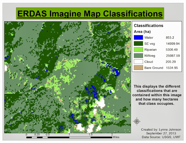
This week we were introduced to ERDAS Imagine, which is an image processing application.  I've been seeing it on my eLearning Desktop for a while now and now we're finally diving into it.  This week was a basic run-down of how to use the application.  Menu bars, sub-menus, how to create a subset of an image.  Unfortunately, the program still seems to need some work because we needed to export our subset image to ArcMap in order to add the finishing touches.  I am hesitant to get excited about a program that might crash often.  That just seems like a lot of frustration.  However, I suppose, in the long run, it'll be good to have at least a basic understanding of what it has to offer.

Below is the subset image we transferred from ERDAS Imagine to ArcMap.  It's a classification map showing how many hectares are occupied by that certain class.  It's a basic map but it involved some learning in ERDAS, which was the point.

Each classification is color coded and labeled with the number of hectares it occupies.

Thursday, September 26, 2013

Special Topics, Week 5: Network Analysis - Prepare Week - Hurricane Evacuation Routes

We started a new project this week leaving statistics in our dusty, messy path.  This week was the "Prepare Week" for our project on Network Analysis.  The scenario is such that the City of Tampa Bay has requested evacuation routes for the areas that may be affected by flooding due to an impending hurricane.  It was also requested that we provide routes for FEMA to aid stations.  To begin, a basemap was needed.  In order to create the map below, a raster file of the area (DEM) was converted into a polygon (vector) file.  I enjoyed learning about this process and how it can be utilized.

By doing so, we were able to select the areas that had an elevation of less than 6 feet.  These were to be considered "Flood Zones" and are identified in the map as a pink color.  Once the flood zones were established, the roads needed to be sorted out as to whether they'd be closed due to flooding.  By utilizing a "Search by Location," we located the roads that fall within these areas of concern and labeled them with a "1" in a newly created field in the attribute table, Flooded.  Some interstate highways fall within those areas, however, will remain open.  To identify those highways, a "Search by Attribute" was performed and we labeled those with a "2" in the Flooded field.  The roads in the non-flood zones were also given a label of 2.

Once a final map was produced, a map package was created, metadata was exported and a professional email was written.  The idea of this was to pass on this project to someone else.  In the real world, others may need to pick up a project where I left off.  This allowed us to see how the process would work and the best way to approach it.    

This map shows the location of 'Flood Zones' in Tampa Bay, FL as well as the locations of possible emergency aid and shelter.

Friday, September 20, 2013

Remote Sensing & Photo Interpretation, Mod4: Ground Truthing & Accuracy Assessment

Following last weeks creation of the Land Use Land Cover map, we continued this week with ground truthing.  By using Google Maps satellite view, we were able to verify out initial LULC assessments.  By randomly picking 30 sample points and creating a new shapefile we compared the codes we provided last week to what that land use/land cover actually was.  It was cool to see the differences.  Areas where I generalized as "Residential" often times had various community buildings dispersed throughout.  After staring at this image for so long last week, it was nice to get down into "Street View" on Google Maps to actually see what was going on.  I enjoyed this lab.


Ground truthing on my LULC map. 70% accuracy.

Above is my LULC map with my 30 randomly selected spots.  The green dots represent accurate code classification, while the red dots represent locations that were not accurate.  After all 30 sample points were verified, an accuracy assessment was done.  This map is 70% accurate.

Wednesday, September 18, 2013

Remote Sensing & Photo Interpretation, Mod3: Land Use/Land Cover Classification Mapping

This week in lab we learned more about Land Use/Land Cover classifications and how to map them.  We were provided with a digital image of Pascagoula, MS.  We were required to identify and label the land use and land cover of the entire image.  We did this by using the Editor tool and creating new features (polygons) and then editing the correlating attribute table with the classification codes and descriptions.  

As you can see below, there are a variety of uses and land covers just in this small image.  They range from residential areas to bays and estuaries.  We did this solely on visual interpretation.  Each classification is labeled with the appropriate numeric code and a color differentiating it from one another.  
Land Use Land Cover classification map of an area in Pascagoula, MS.