Powerpoint Presentation: Here
Slide -by- Slide Commentary: Here
Showing posts with label Applications in GIS. Show all posts
Showing posts with label Applications in GIS. Show all posts
Thursday, August 8, 2013

Tuesday, July 16, 2013
Applications in GIS, Lab 9: Location Decision Analysis
This week we worked with location analysis and weighted analysis. The scenario is: a couple is looking for a home in Alachua County, Florida. The woman is a physician and works at the North Florida Regional Medical center and the man works as a professor at the University Florida. They have 4 specific criterion which are: Close to NFRMC, close to UF, in a neighborhood with a high percentage of people aged 40-49 and an area with high percentage of home value (home owners).
 |
| Basemap of Alachua County, FL |
The first map we created is a base map of the county in which they want to move. Here you can see cities, major roads, and public lands (and by who they are owned).
 |
| Four specific criteria requested by the couple who is house hunting. |
The second map we created were 4 different data frames containing each of the criterion. We used the Euclidean Distance Analysis tool, reclass tool and feature to raster tool to determine which census tracts would be more suitable than others.
 |
| Weighted Analysis. We put more weight on the proximity criteria to change the ideal tracts. |
The final map was created with ModelBuilder and the weighted overlay tool. The map to the left was created with equal parts weighted or each criteria (of 4) was weighted at 25%. The scenario then had the couple concerned about traffic, so two of their criteria then became more importance. So we weighed them differently. The proximity to the hospital and school became more important (weighted at 40%) than the high home value neighborhood and age range.
Wednesday, July 10, 2013
Applications in GIS, Lab 8: GIS in Local Government
This week in lab we learned about how GIS is used in local governments. In this instance, we focused on land appraisals and how your local county appraisers office uses GIS. The environment impact of a fly-in community needed to be assessed via the parcels surrounding this selected parcel. First, we used the Marion County Appraisers Office website to learn about the selected parcel (Mr. Zuko's) and the surrounding area. This is a screen shot of the image from that website. You can see there is a jet parked in the driveway....
 |
| Aerial image of Mr. Zuko's parcel |
Secondly, we made a Environmental Impact Assessment parcel basemap. Here you can see Mr. Zuko's parcel and the surrounding adjacent parcels that may be impacted. We used a table to identify each parcel by map key number, parcel ID number, zoning type, owner, acreage and address. Each parcel is labeled 1-9 and corresponds in the table.
 |
| EIA parcel basemap surrounding Mr. Zuko's parcel. |
We also utilized Data Driven Pages which allowed a map book to be created. Adding a grid to the adjacent parcels let us create a locator map. We could stay zoomed in to 1:2400 of each grid and while only that data frame changed. It saves a lot of time and effort if something minor needed to be changed on one map - this way you wouldn't have to go through all 12 maps.
Our final map was part of a different scenario. The Gulf County Board of County Commissioners (BOCC) wants to build a new extension office and needs to find out some locations that are possible. The criteria were:
1. Must be county owned
2. 20 Acres of larger
3. Vacant land
Using various selection by location and attributes searches we were able to narrow it down to two possible parcels that meet the above criteria. Below, you can see aerial maps with the two parcels selected in red and blue. The two data frames on the bottom allow close-up views of each parcel including the total acreage.

Saturday, July 6, 2013
Applications in GIS, Participation #2: Local Governments
Q1: Does
your property appraiser offer a web mapping site? If so, what is the web
address? If not, what is the method in which you may obtain the data?
Yes, it seems as
though the Madison property appraiser offers web mapping – the site is: http://www.madisonpa.com/GIS/Search_F.asp?SalesReport
Q2: What
was the selling price of this property? What was the previous selling price of
this property (if applicable)? Take a screen shot of the description provided
to include with this answer.
6/24/13 was the selling
date. Selling price was: $50,000. The
previous selling price listed was $10,000 in 1980.

Q3: What
is the assessed land value? Based on land record data, is the assessed land
value higher or lower than the last sale price? Include a screen shot.
The assessed land
value is $19,612.00. This is lower than
the sale price.

Q4: Share
additional information about this piece of land that you find interesting. Many
times, a link to the deed will be available providing more insight to the sale.
I found it cool that
they included an aerial image and a front building image. It’s also interesting that the land value is
only $19,612 but the building value is $72,288 and it sold for $50,000.


Q5: Which
accounts do you think need review based on land value and what you’ve learned
about assessment? Please answer this question within your blog post.

Tuesday, July 2, 2013
Applications in GIS, Lab 7: Homeland Security - Protect
This week we concluded the Homeland Security portion of the course by using the data we prepared last week. We were focusing on the Boston Marathon bombings and security & surveillance. The first map we created shows the 10 closest hospitals to the finish line. Here we took into consideration the types of hospitals and only focused on the non-specialized, non-campus, non-rehab hospitals. You can see the hospitals are labeled and the local streets were provided as some reference. I also included an inset map giving you a better idea of where we're focusing.
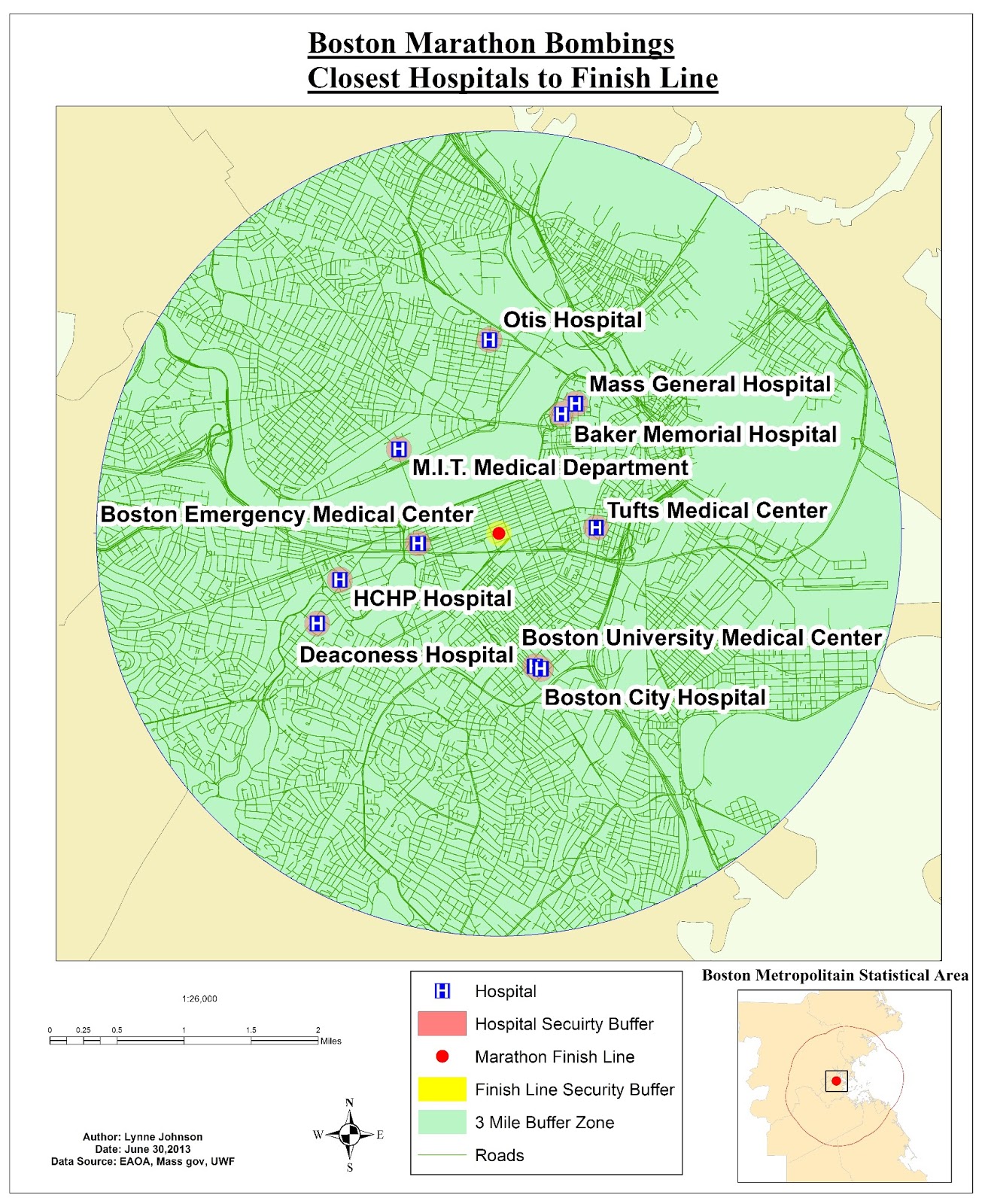 |
| 10 closest hospitals to the marathon finish line |
The second map we created as a security check point buffer. We created a 500 foot buffer zone around the finish line and placed security checkpoints around the perimeter. The location of the check points were created where the security zone intersects with the roads. Again, an inset map was provided for reference.
 |
| Security perimeter checkpoint locations surrounding the finish line. |
Finally, the third map I created is a surveillance and line of sight map. We used hillshade and viewshed. Hillshade allows you to view where the sun's shade will be at a specific time of day using the altitude and azimuth of a certain location. The viewshed uses the surveillance points to show you what will and will not be visible. In this particular map, green is visible and pink is not. Using the 3D-Analyst tool, I then mapped out a few points and used the finish line as the target location. There you can see along that line of sight path, where obstruction are. The red portion of the line is an obstruction and the green is a clear path.
 |
| Line of sight and surveillance map of the Boston Marathon finish line. |
Friday, June 28, 2013
Applications in GIS, Lab 6: Homeland Security - Prepare MEDS

Wednesday, June 19, 2013
Applications in GIS, Lab 5: HLS - Washington D.C. Crime
This week was the introduction into how GIS is used in Homeland Security. We focused on the crime in Washington D.C. and used various techniques to analyze it. This first map is a map is a basic outline of Washington D.C. with all of the police stations labeled. You can see where all the crime take place in relation to the population density.
 |
| Washington D.C. Crime and a graph displaying what types of crimes occurred the most often in January of 2011. |
The second map we created, focuses more on the police stations. We broke down the crimes based on each police station and determined where new substations would work well.
 |
| The red proposed substations were placed in areas with high crime rates and were relatively far from existing stations. |
 |
| Density of crime: Burglary, Sex Abuse and Homicide in Washington D.C. in January of 2011. |
Subscribe to:
Posts (Atom)