Wednesday, July 3, 2013

GIS Programming, Lab 6: Explore & Manipulate Spatial Data

This week definitely tested my sanity! We had to write a script that created a new file geodatabase, copied all the files from our data folder and pasted them, in correct format, into the new .gdb and then create a blank dictionary and then populate it with the names and population of the cities that are categorized as "County Seats."  The toughest hurdle I had was figuring out how to insert the list variable into the print message.  Of course, it was a simple fix and was the ONE option I did not try.  I also struggled with the searchCursor. 

Screenshot of the results of my script - created new gdb, copied the files and printed the cities/populations.

With the help from the instructors and TA's I was able to figure out the issues I was encountering and move forward.  I have had very little experience with programming in my past and am finding it difficult to grasp, but hopefully in the (near) future, things will start clicking.

Tuesday, July 2, 2013

Applications in GIS, Lab 7: Homeland Security - Protect

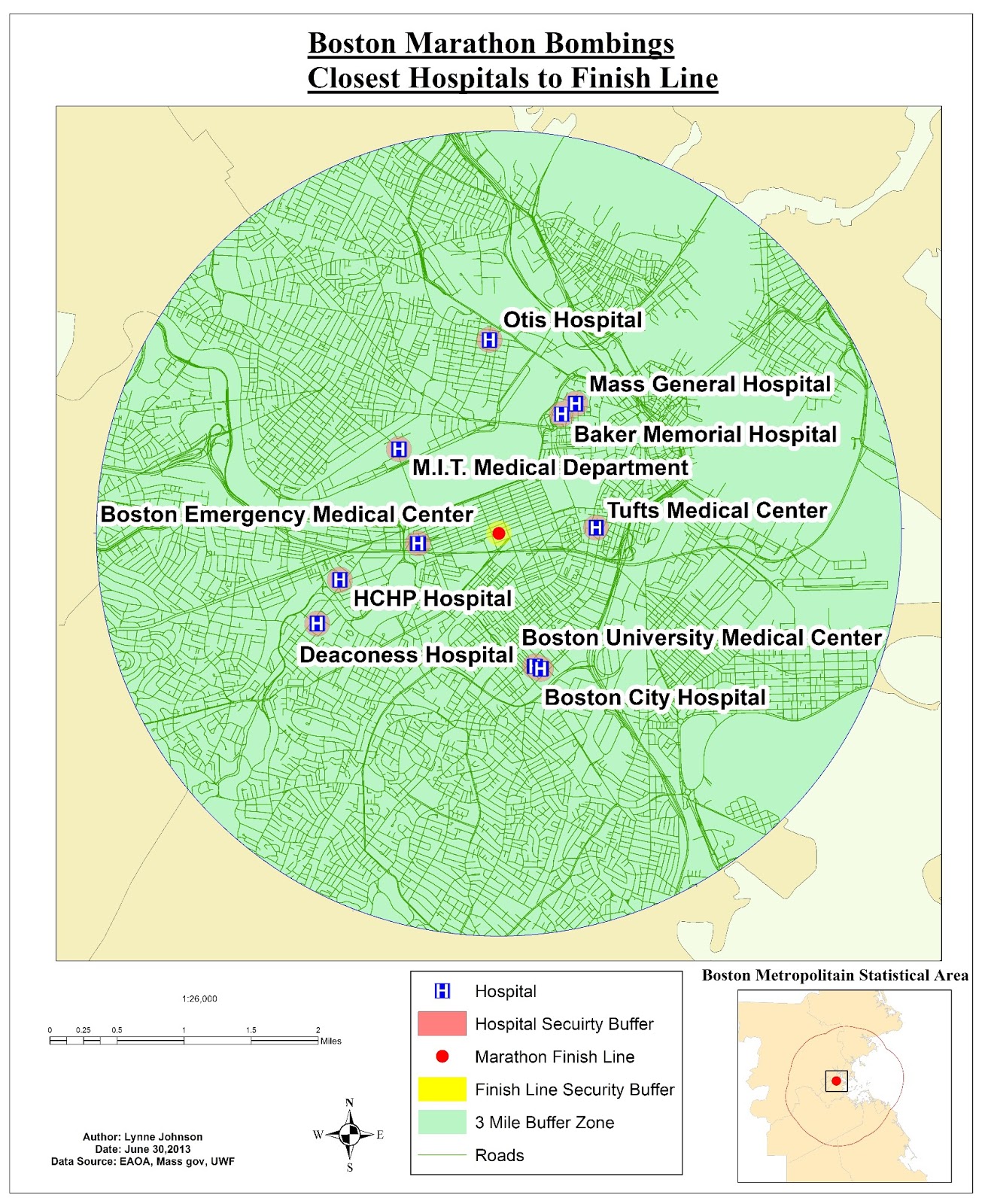
This week we concluded the Homeland Security portion of the course by using the data we prepared last week.  We were focusing on the Boston Marathon bombings and security & surveillance.  The first map we created shows the 10 closest hospitals to the finish line.  Here we took into consideration the types of hospitals and only focused on the non-specialized, non-campus, non-rehab hospitals.  You can see the hospitals are labeled and the local streets were provided as some reference.  I also included an inset map giving you a better idea of where we're focusing.

10 closest hospitals to the marathon finish line
                                     
The second map we created as a security check point buffer.  We created a 500 foot buffer zone around the finish line and placed security checkpoints around the perimeter.  The location of the check points were created where the security zone intersects with the roads.  Again, an inset map was provided for reference.

Security perimeter checkpoint locations surrounding the finish line.

 Finally, the third map I created is a surveillance and line of sight map.  We used hillshade and viewshed.  Hillshade allows you to view where the sun's shade will be at a specific time of day using the altitude and azimuth of a certain location.  The viewshed uses the surveillance points to show you what will and will not be visible.  In this particular map, green is visible and pink is not.  Using the 3D-Analyst tool, I then mapped out a few points and used the finish line as the target location.  There you can see along that line of sight path, where obstruction are.  The red portion of the line is an obstruction and the green is a clear path.

Line of sight and surveillance map of the Boston Marathon finish line.

Sunday, June 30, 2013

GIS Programming, Lab 5: Geoprocessing with Python

This week in lab, we learned about geoprocessing with Python.  I found this lab to be a little stressful, but very rewarding once I was able to figure it out.  The outline of it was to create a script that would add XY coordinates to the hospitals shapefile, create a 1000 meter buffer around each hospital point and then dissolve the buffer layer.  Below is a screenshot of the Interactive Window using PythonWin once my code was successfully run.


First, I added my comments to the script.  Those included my name, the date, the script name and a brief description of what the end result should turn up.  I imported arcpy and set the environments.  I made sure I was able to run the script more than once using overwriteOutput.  The next step was to use the AddXY tool.  I used the Help section of ArcGIS to look at a sample code and syntax for the AddXY function.  After that, I turned, once again, to the Help section to look at sample code and syntax for the Buffer tool.  Here I needed to write a code that would create a 1000 meter buffer around each hospital point.  Once that was done, I needed to dissolve the buffers together.  Using the ArcGIS Help section, I reviewed sample code and the syntax for the dissolve function.  Finally, I made sure that the comments appeared after each step of code, letting me know it was run successfully.

This lab definitely helped me get a better grasp and understanding of using the tools in Python.

Friday, June 28, 2013

Applications in GIS, Lab 6: Homeland Security - Prepare MEDS


This is a screen shot of the minimum essential dataset set forth by the Department of Homeland Security for the Boston Metropolitan Statistical Area.  Group layers were created and distributed by boundaries, hydrography and transportation.  The .lyr files contain all the symbology and scale for each group for ease of use later on in the next lab.

Wednesday, June 19, 2013

Applications in GIS, Lab 5: HLS - Washington D.C. Crime

This week was the introduction into how GIS is used in Homeland Security.  We focused on the crime in Washington D.C. and used various techniques to analyze it.  This first map is a map is a basic outline of Washington D.C. with all of the police stations labeled.  You can see where all the crime take place in relation to the population density. 

Washington D.C. Crime and a graph displaying what types of crimes occurred the most often in January of 2011.
The second map we created, focuses more on the police stations.  We broke down the crimes based on each police station and determined where new substations would work well. 

The red proposed substations were placed in areas with high crime rates and were relatively far from existing stations.  
 The third and final map we created, we used a kernel density tool.  I had a lot of issues with this tool, but was able to overcome them with the help of the professors and some fresh data.  In this map, I keyed in on three different types of crime, burglary, sex abuse and homicide.  I also provided an inset map of the population density for comparison reasons.

Density of crime: Burglary, Sex Abuse and Homicide in Washington D.C. in January of 2011.
This week was definitely challenging but it's always fun to learn new things and find new ways to work around and fix problems.

Sunday, June 16, 2013

Applications in GIS, Participation Assignment #1

Article Outline: The Incident Map Symbology Story
Link: http://www.napsgfoundation.org/blog/napsg-blog/131-the-incident-map-symbology-story
By: Lt. Chris Rogers
Date Published: May 4, 2012
Outlined by: Lynne Johnson
Date: June 11, 2013

As you can imagine, maps are very useful tools when it comes to emergency response.  They can provide a wealth of information about previously existing data along with the current emergency situation, whatever that may be.  Across many agencies, maps are indicative to success, however, inconsistencies can be more burden than help.  This article emphasizes the need to have consistent symbology in maps across different first responding agencies.  They refer to this consistency as the “Common Operating Picture.”  This is an important issue because if that one group, or even, one person isn’t available to understand and convey the map then emergency response could be delayed.  And a delay like that could cost lives.  The goal of this project was to come up with universal symbols that would have the same meaning across various agencies all while:

Setting guidelines instead of standards
Creating symbols that can be hand drawn
Having symbology what doesn’t require a lot of training to understand
Creating symbolofy that is usable in routine business of a public safety agency.

This problem was approached with the help from NAPSG Foundation, the DHS S&T First Responder Group and FEMA's National Integration Center.  A small group of first responder practitioners with knowledge of GIS were put together and posed with this issue.  Keeping in mind the bulleted points above, they used a probable situation of a building fire to create a map with working symbology.  Initially, they had two conference calls to get the ball rolling with ideas and end goals which eventually led to several in-person meetings to go over what they had come up with.  The correspondence between several agencies to work on this problem was a particularly smart method.  It allowed for numerous difference view points all while having the same end goal.

The result was that they came up with different categories of symbols for “pre-incident, hazard and incident command.”  Specific key factors are that:
“The shape of symbols is defined by the category”
“What is IN the shape is dependent on the map output and use”
“Can be hand drawn”

These results are based on a small-scale incident; however, the symbology required will be used across a wide variety of incidents, including large scale.  They recognize that this is only a small step in the right direction for map consistency throughout various agencies for emergency response. However, with the progress they made other groups can learn from their methods and use their results off of which to build.  This article provides a great example of how GIS can aid in crime analysis, but mostly aid in law enforcement.  Trends can be tracked about incidents; several attributes coinciding with the incident can be noted and analyzed.  This article relates to this week’s lecture and lab because it speaks to keeping our communities safe.  Once we gain consistent symbology, we can move on to prevent and mitigate incidents.

Wednesday, June 12, 2013

Applications in GIS, Lab 4: Hurricanes

This past week in lab, we still focused on natural disasters - however, we keyed in on hurricanes.  More specifically, Hurricane Sandy.  We worked on plotting a hurricanes path, turning points to a path using the Point to Line tool.  We also learned a little more about creating customized markers - in this case the hurricane symbols.  We labeled each point with the MPH winds and barometric pressure; two key elements in hurricane categorizing.

Hurricane Sandy's path up the Atlantic Coast starting as a tropical depression and ending as a post-tropical cyclone. 

The second map we created, we used aerial images of the New Jersey shore that were taken before the hurricane hit and after.  We learned about cool effects that can be used to compare before and after pictures almost immediately.  We created new data by creating attribute domains - which allowed for the classification of each building. Each building structure was categorized based on the amount and type of damage sustained.  

Before and after structure damage comparison of Fielder Avenue in Ocean County, NJ.